Pediatric Center
[second year]
As a designer, one of the major goals of the setting of a pediatric office is not only make the space you are designing feel as you belong, but to make it a space where people can enter and feel safe through their surroundings. This is what I wanted when designing around the word, “Serene.” My priority was designing a space where children and adults could go to experience a calm and peaceful place that through research and other designs is a concept that is difficult to do.

logo/branding

diagrams

floor plan

rendered floor plan

reflected ceiling plan

office logo wall

reception desk #1

reception desk #2

sitting area #1

sitting area #2

kid's waiting area nook

exam room #1

exam room #2

exam room entrance
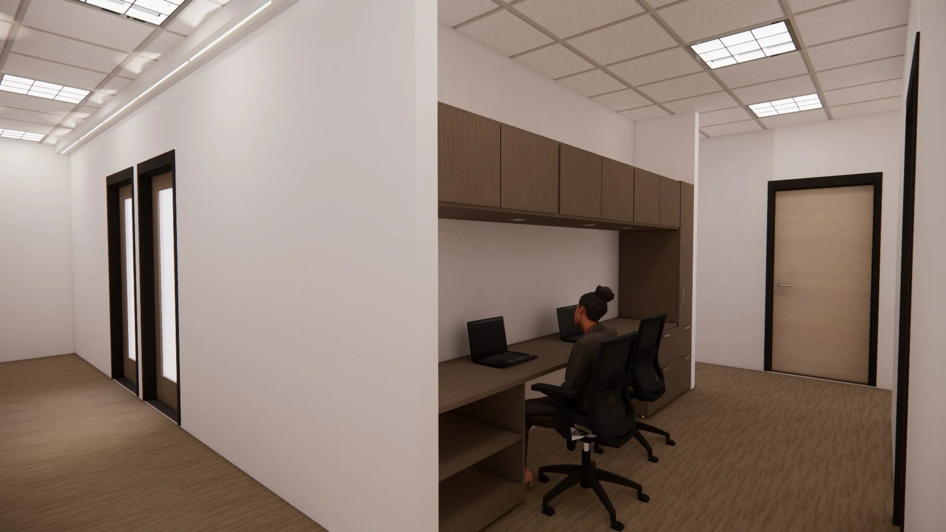
nurse's heads down space

nurse's private work area
Serene. The meaning of this word translates to being utterly clam, peaceful, and untroubled by anything. To take a step outside and seeing the clearness of the sky or looking at the calm ocean ahead. It seeks quietness and the ability to be free from disturbance
The idea I had was bringing the patience that enter the space to feel as if they are surrounded by an ocean. The blue, browns, whites, and greens all represent the meaning of the ocean features. It was thought to introduce these colors that can lead to a feeling of freeness, along with reducing stress because in this world, the idea of feeling stressed feels like a common idea. Where in a space like, “Serene,” it is somewhere were stress is forgotten about, even if it is for a short period of time.
Concept: “Serene”